The new creative director makes his debut with a striking new pantone colour.
Ferragamo Spring/Summer 2023
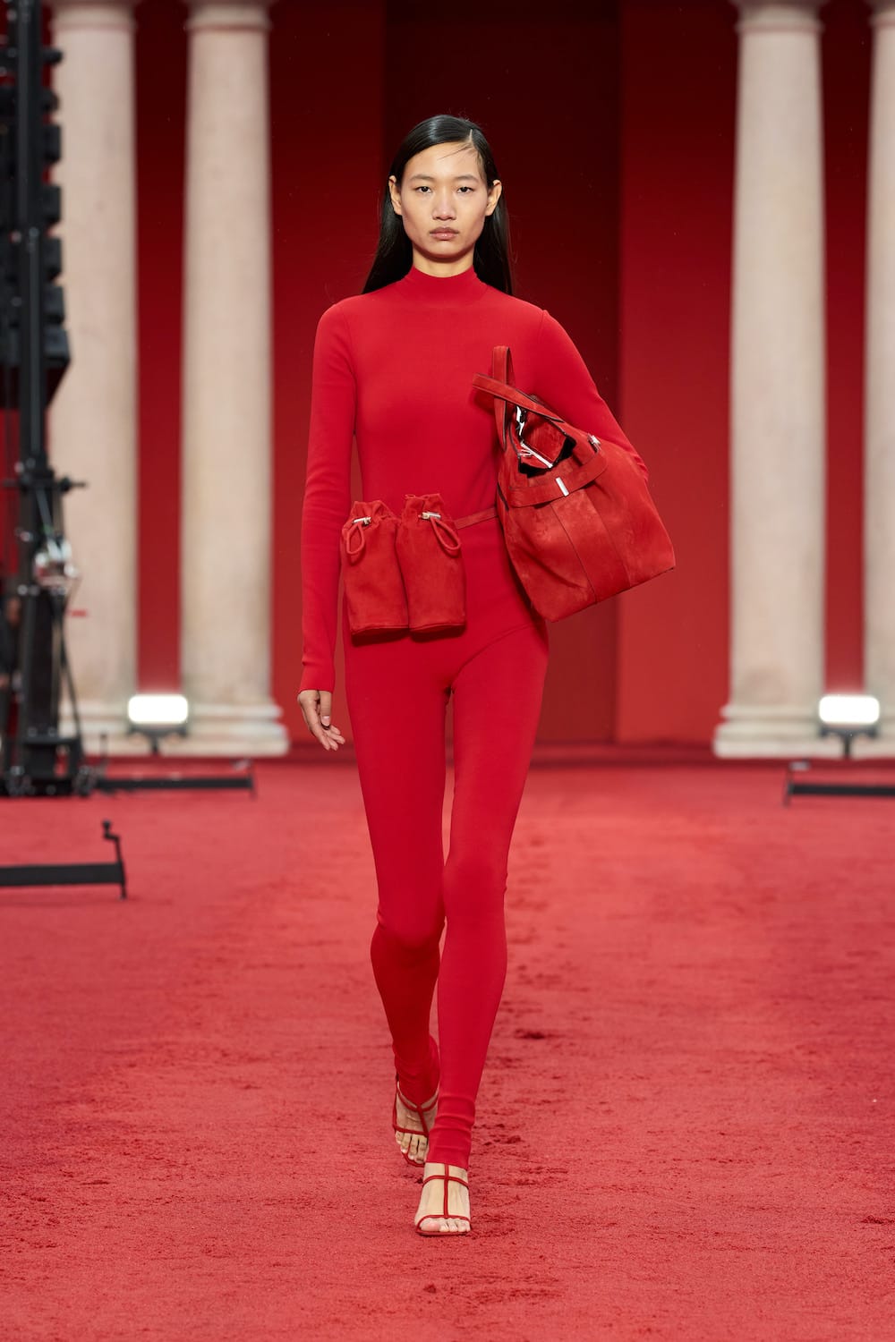
Just three days before Maximilian Davis’ debut show, an email came through sharing the brand’s new logo (designed by Peter Saville) set against a striking red hue. “Salvatore Ferragamo becomes FERRAGAMO” read the email, signifying “a conversation between the classic and the contemporary, based on both heritage and a clear vision of the now.” Along with the email, the brand’s official Instagram account was peppered with images and clips of objects and landmarks bearing the distinctive hue.
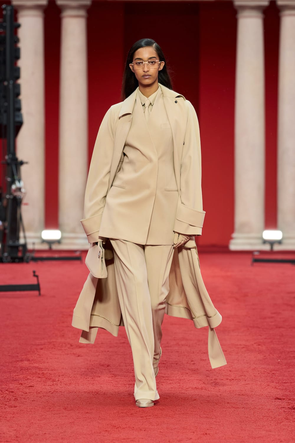
The new colour, officially known as Pantone Red 3546C, made an arresting presence at the show’s 17th century venue, declaring not only a fresh start for the brand but also marking the beginning of Davis’ tenure at the renowned Italian House; red walls together with the grand pillars of the Baroque and Neoclassical facade of the Seminary, created a picturesque vision that courted the right attention, while red sand, soaked but not dampened by the wet weather, dominated the grounds of the grand courtyard. Visual impact aside, to Davis, the colour was also somewhat personal; a reflection of his Caribbean roots. “The sand relates to Ferragamo, to Hollywood, to the ocean—but also to me, and to my own DNA. To what the sea means to Caribbean culture: a place where you can go to reflect and feel at one. I wanted to show that perspective, but now through the Ferragamo lens.”
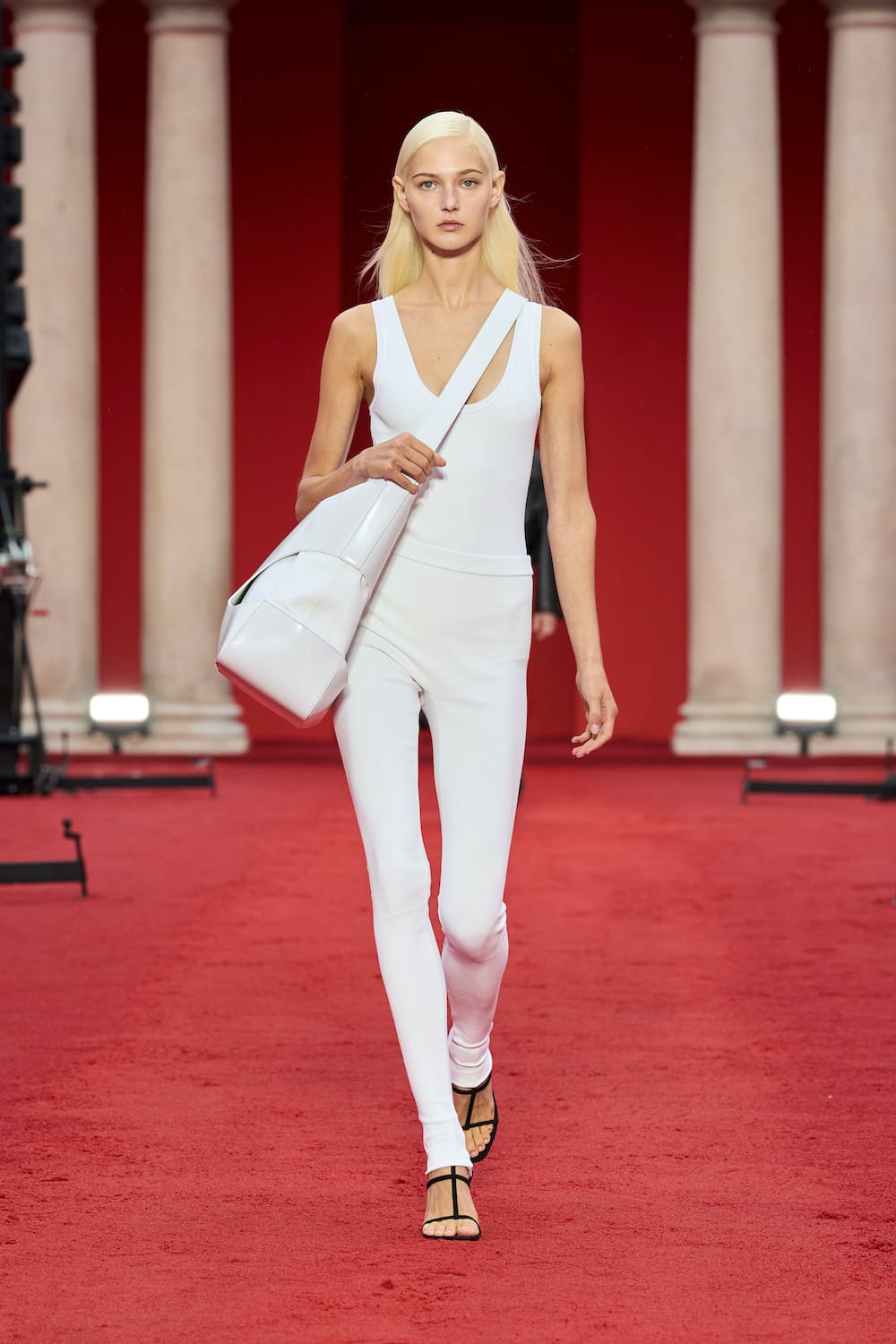
Kicking off his first runway at Ferragamo, Davis decided to look deep into the DNA of the brand, choosing to celebrate its spark ignited by its long-standing relationship with Hollywood. “I wanted to pay tribute to Salvatore’s start by bringing in the culture of Hollywood—but new Hollywood,” explained Davis in press notes. “Its ease and sensuality; its sunset and sunrise.” A romantic notion that Davis continued through concise colour palettes that included ombre prints both cold and warm, optic white, black, and of course, red.
On the runway, languid and tasteful looks transpired as sinuous fits that clung close to the silhouette; draped see-through evening dresses that were both sensual and feminine; and luxurious silk and organza that fluttered with movement. These were juxtaposed effortlessly with tailored pieces that were given a slightly more relaxed yet “perfectly-proportioned” fit. Meanwhile, everyday essentials were twisted and transformed into sleek and diaphanous figures that reflected the casual elegance of a simple yet modern wardrobe. One fun look to note included a utilitarian jumpsuit crafted from technical fabric (look number 4 below) that transformed under the influence of heat, and yes, we had a field day with it at the resee. Finally, touches of Hollywood sparkled through pieces heavily embellished in crystals—a nod to Marilyn Monroe’s red crystal encrusted pumps created in 1959—seen across ready-to-wear and accessories.
Below, our favourite looks from Davis’ debut collection.


